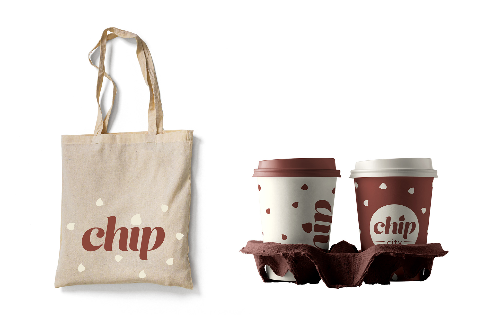
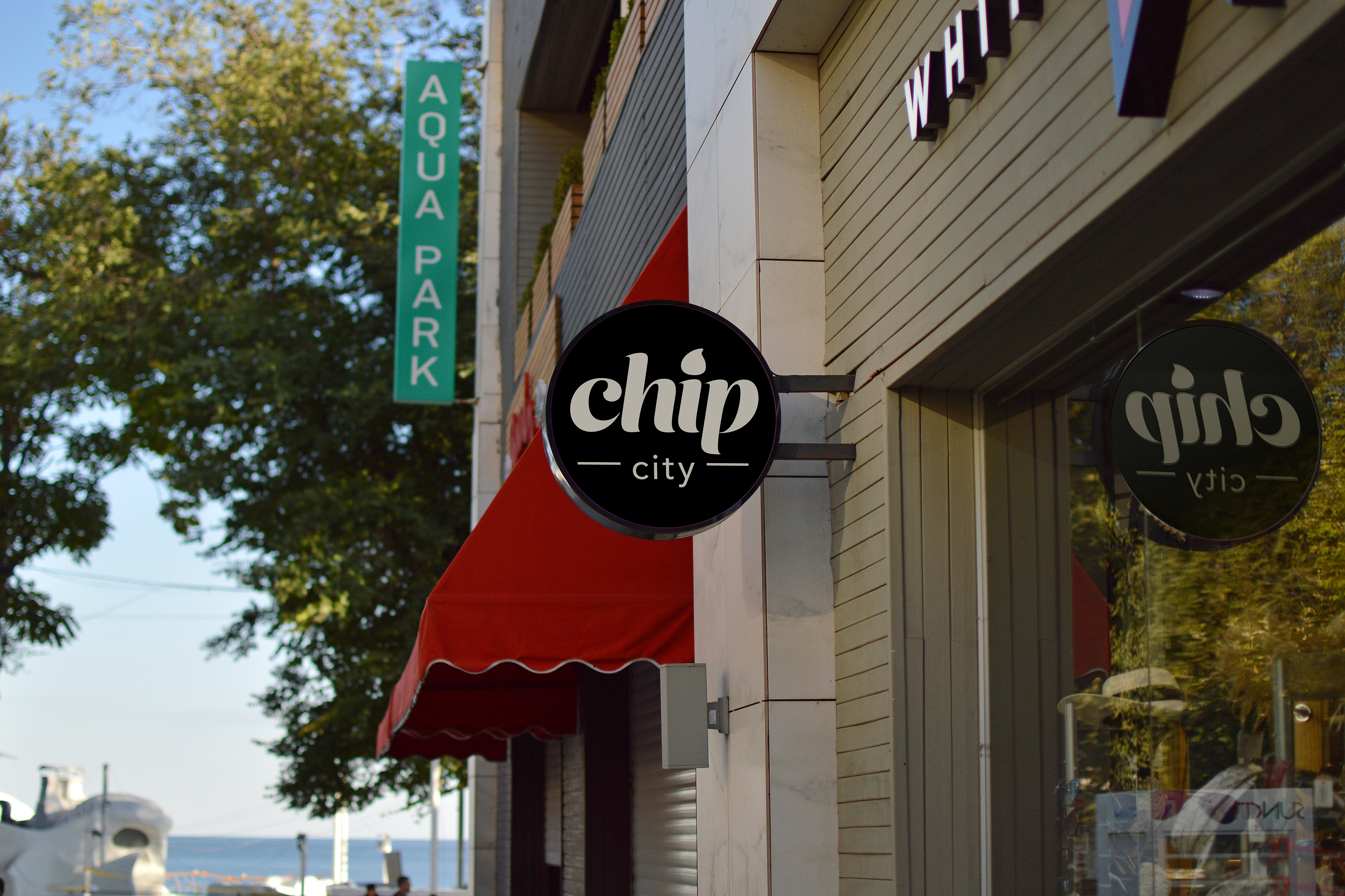
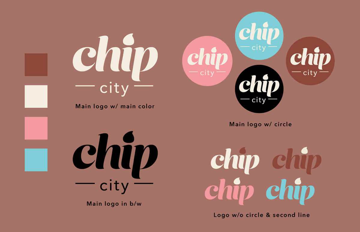
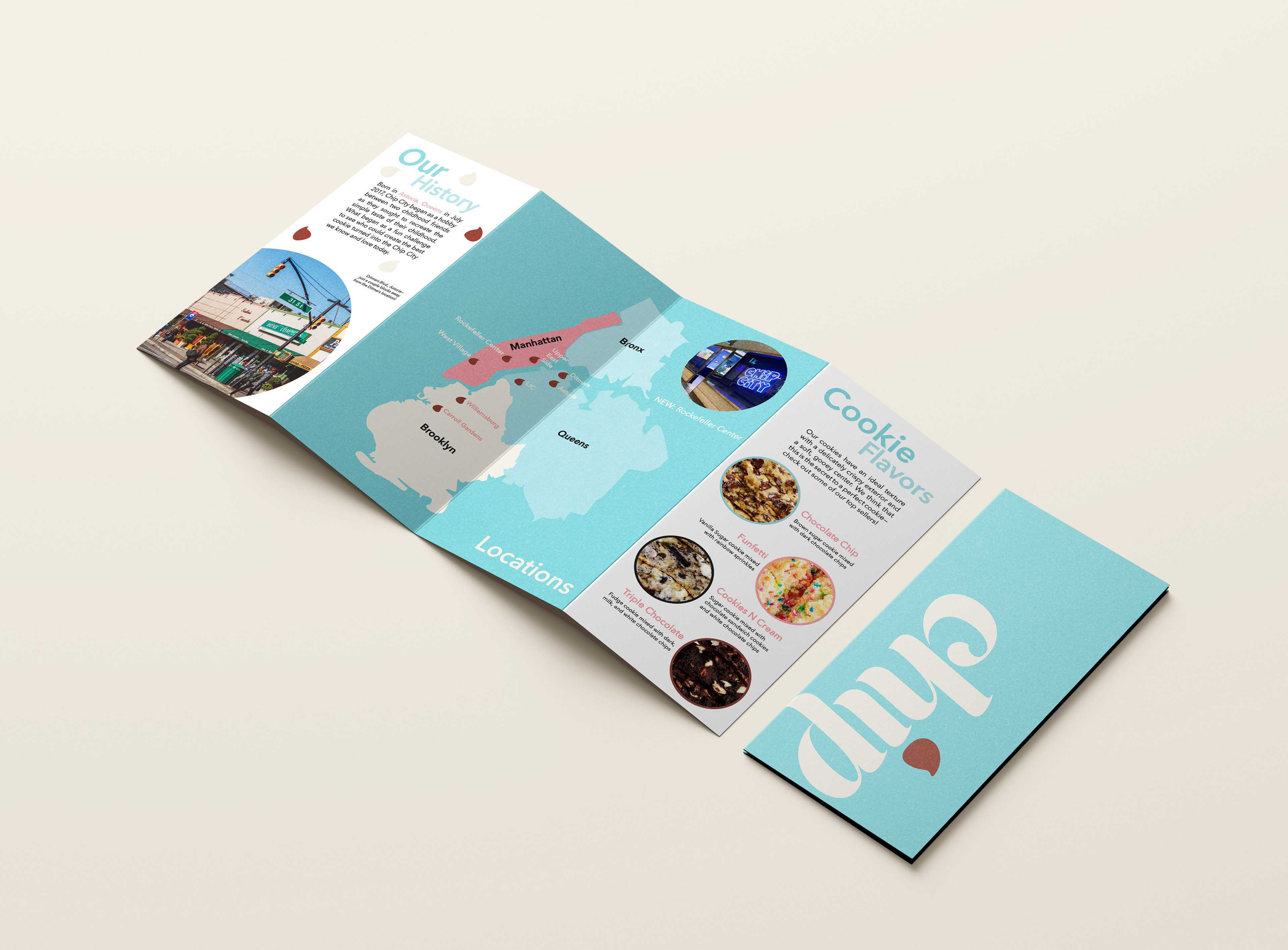
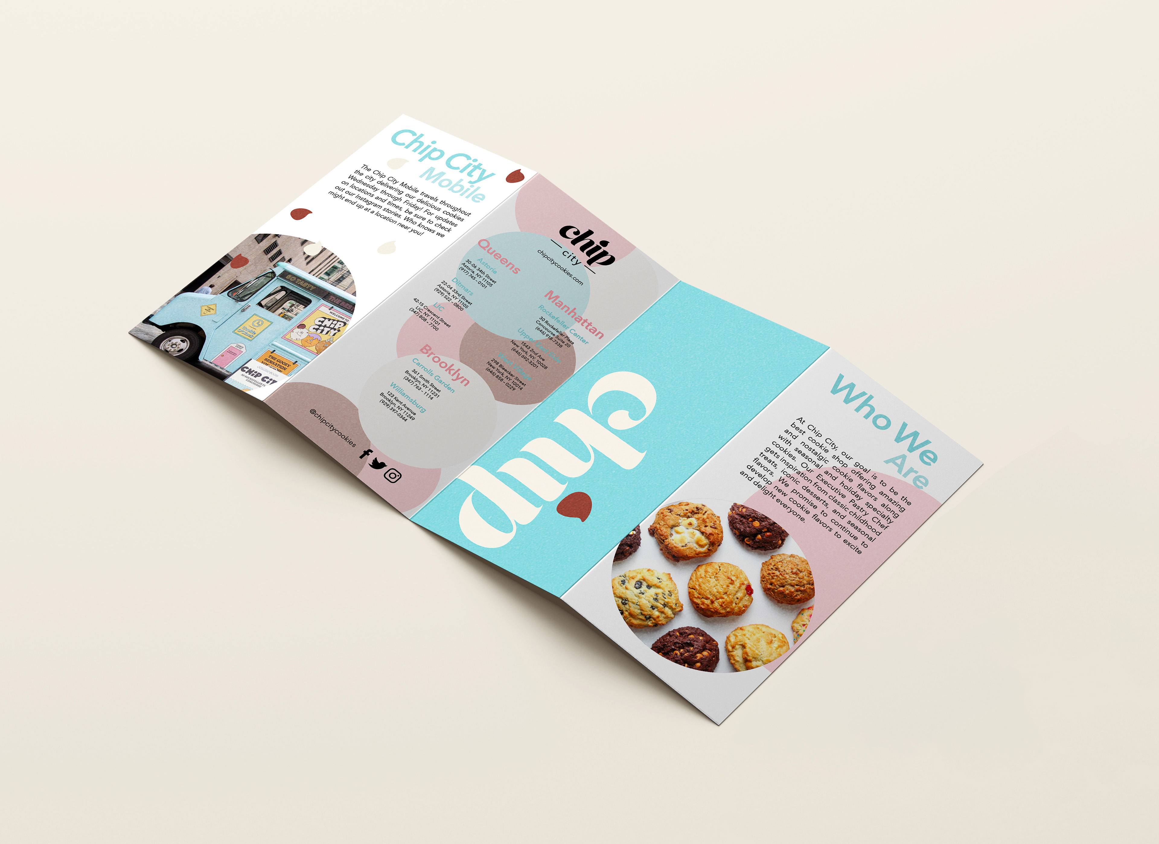
Chip City
I redesigned a local cookie shop called Chip City. I wanted to make the branding better correlate with their current customers; without losing their sense of playfulness. I also created a fold-out as an extra branding piece that gives the customer a snapshot of the company.
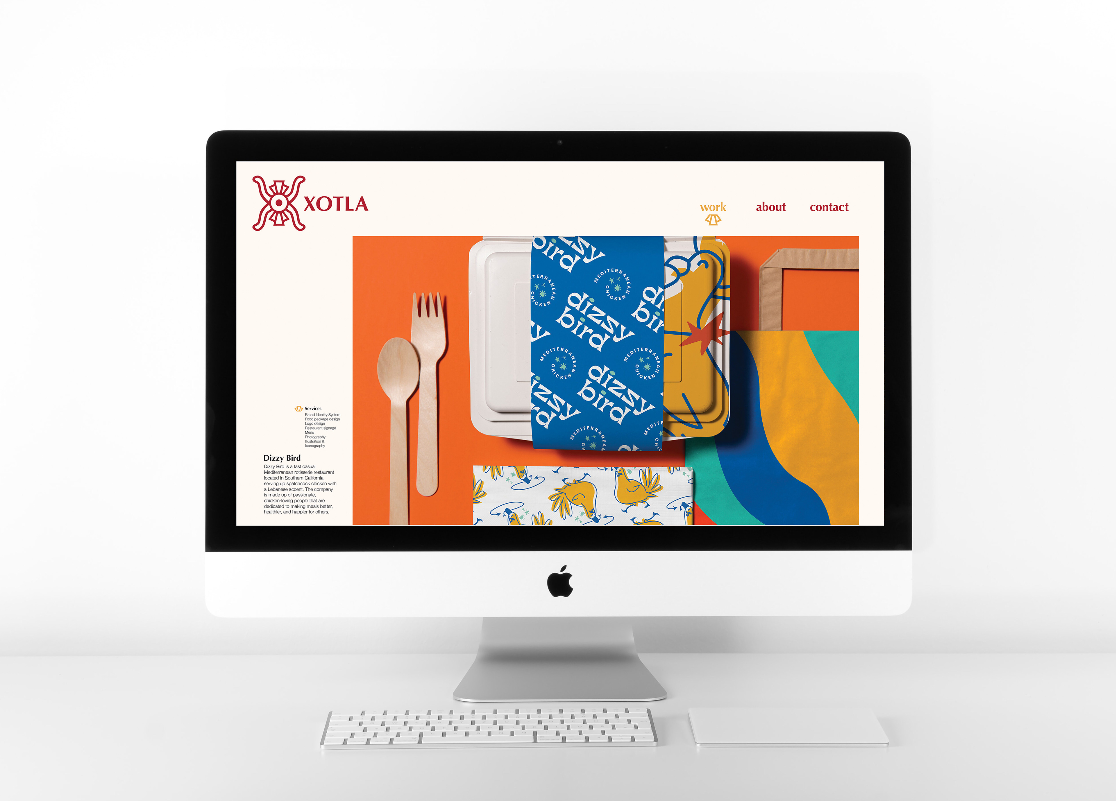
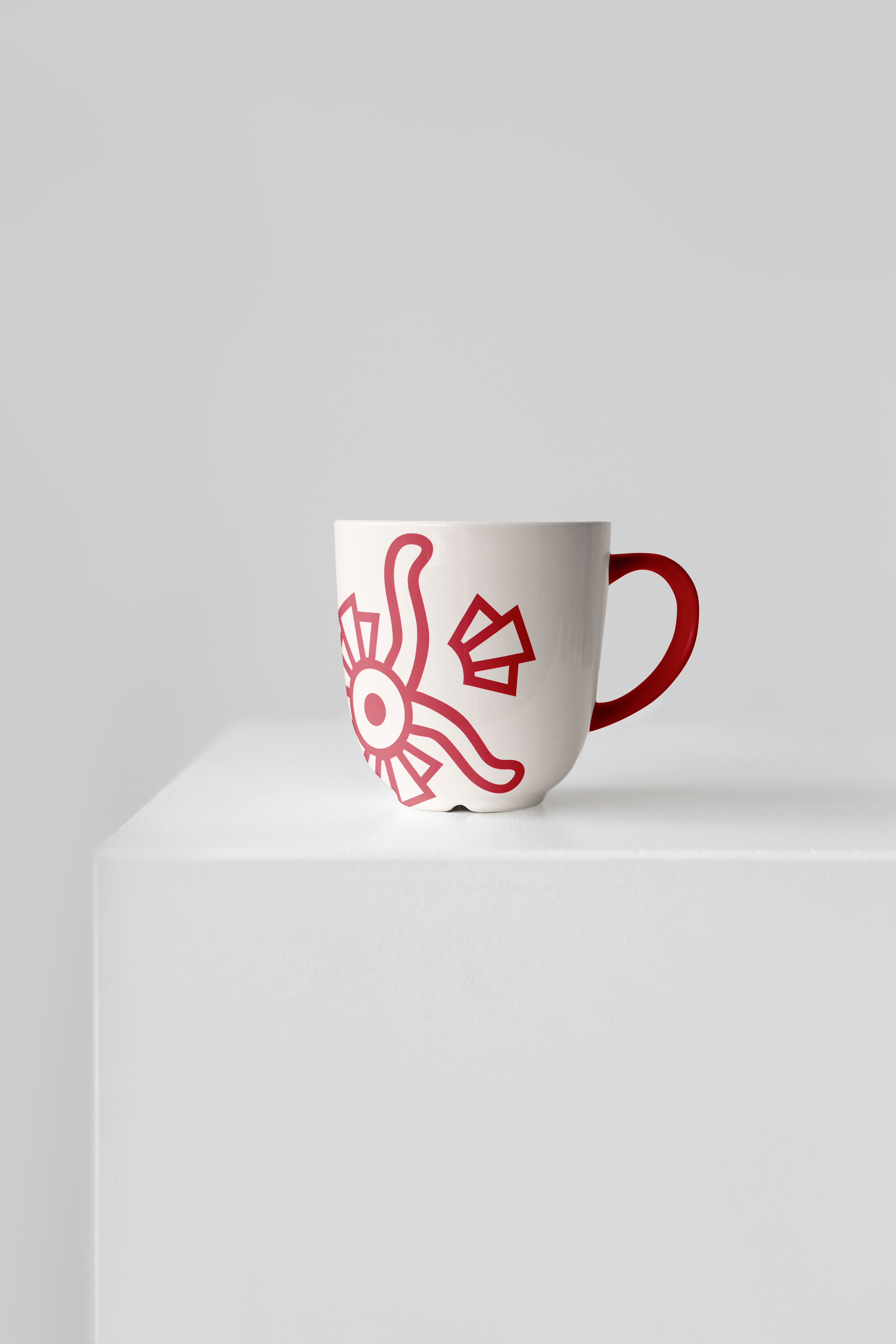
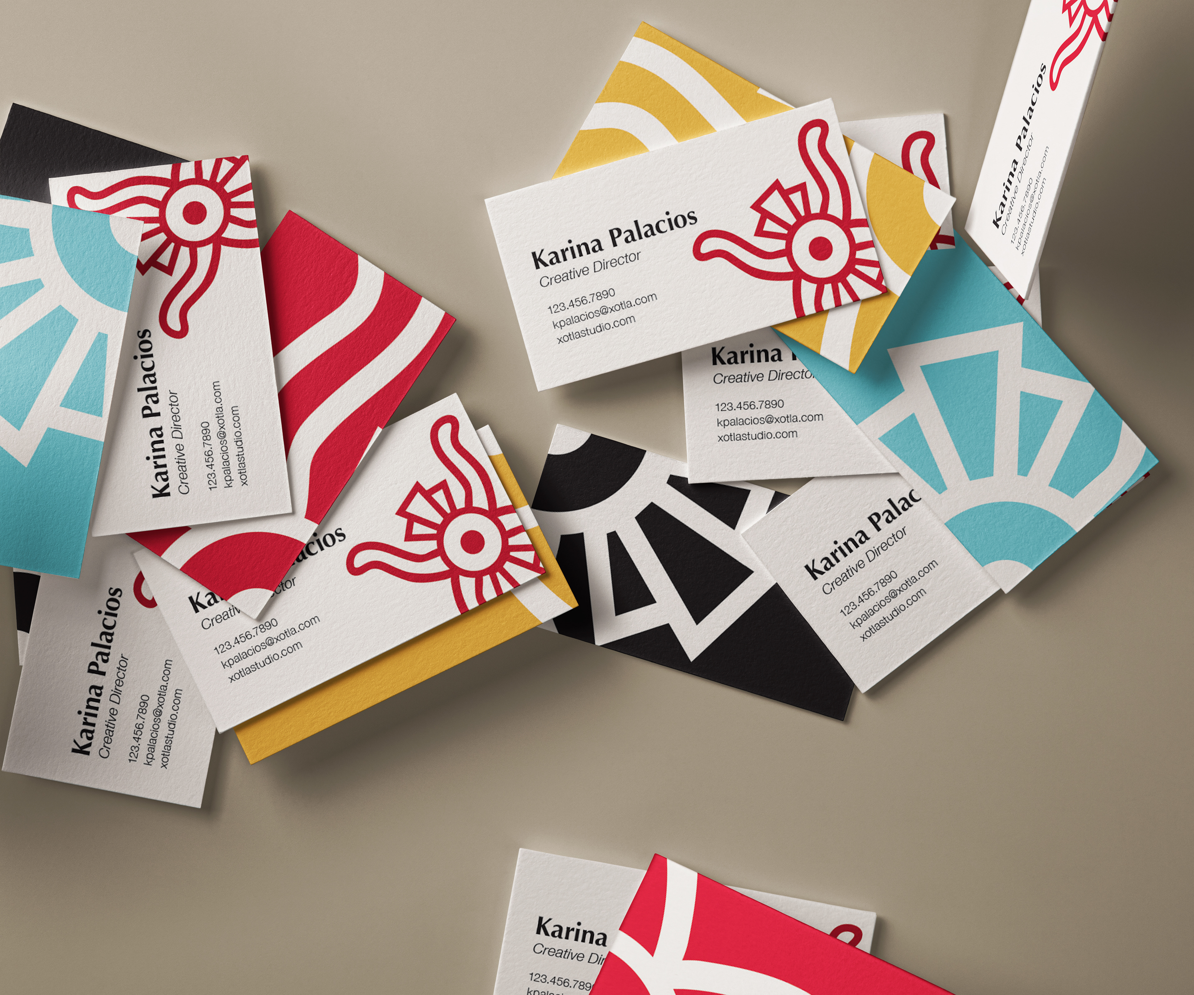
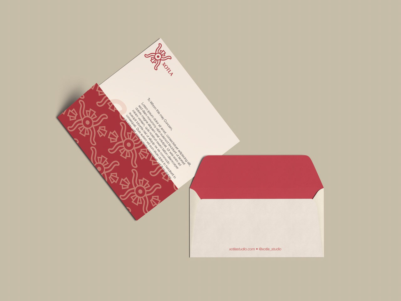
Xotla
As part of my extracurricular classes, I was able to self-initiate any project of my choosing. I chose to focus on the business side of graphic design since it's not part of our current curriculum. I developed my design studio called Xotla. From this course, I learned its vast components, one of which was creating a brand identity for this studio.
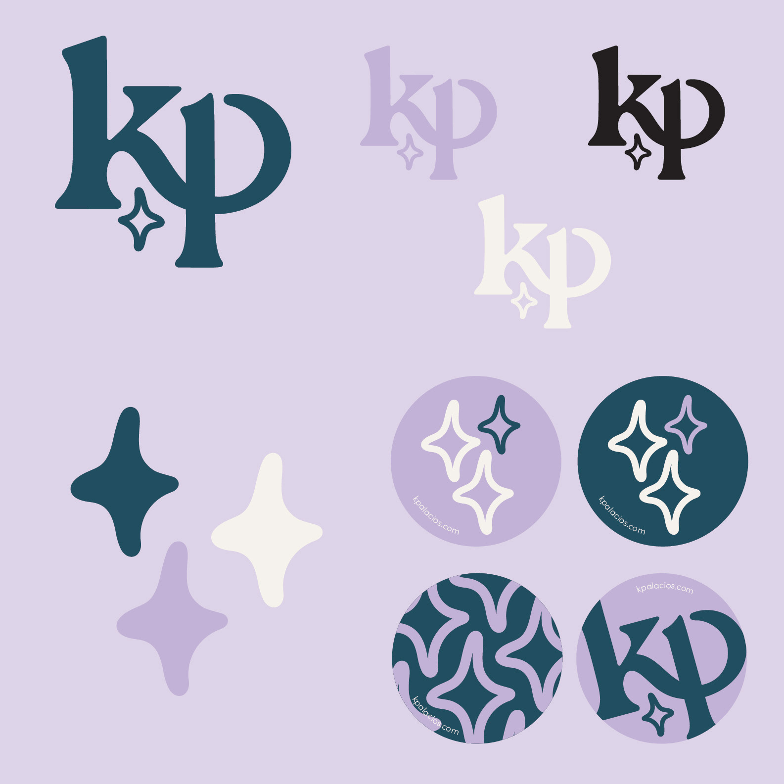
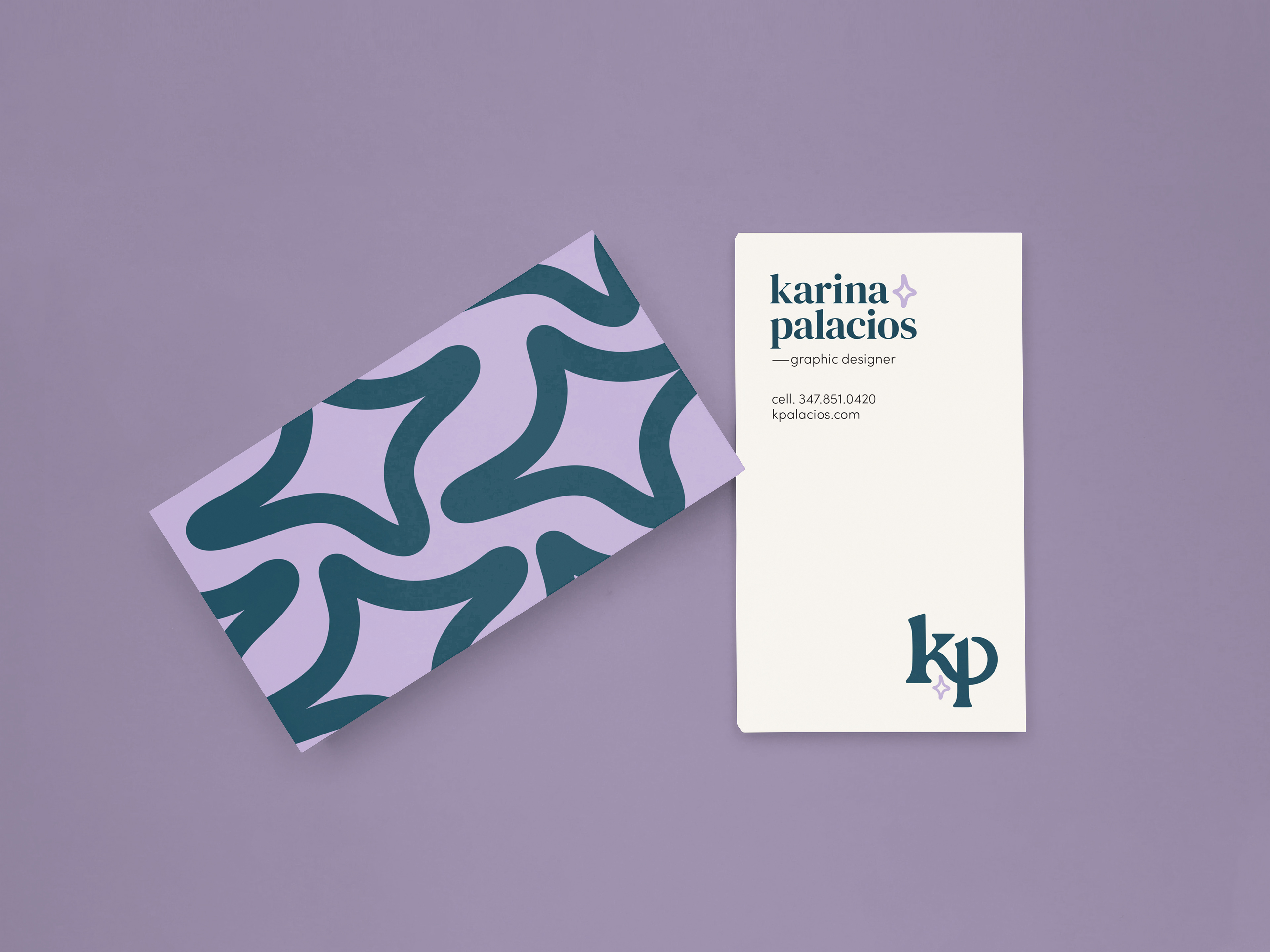
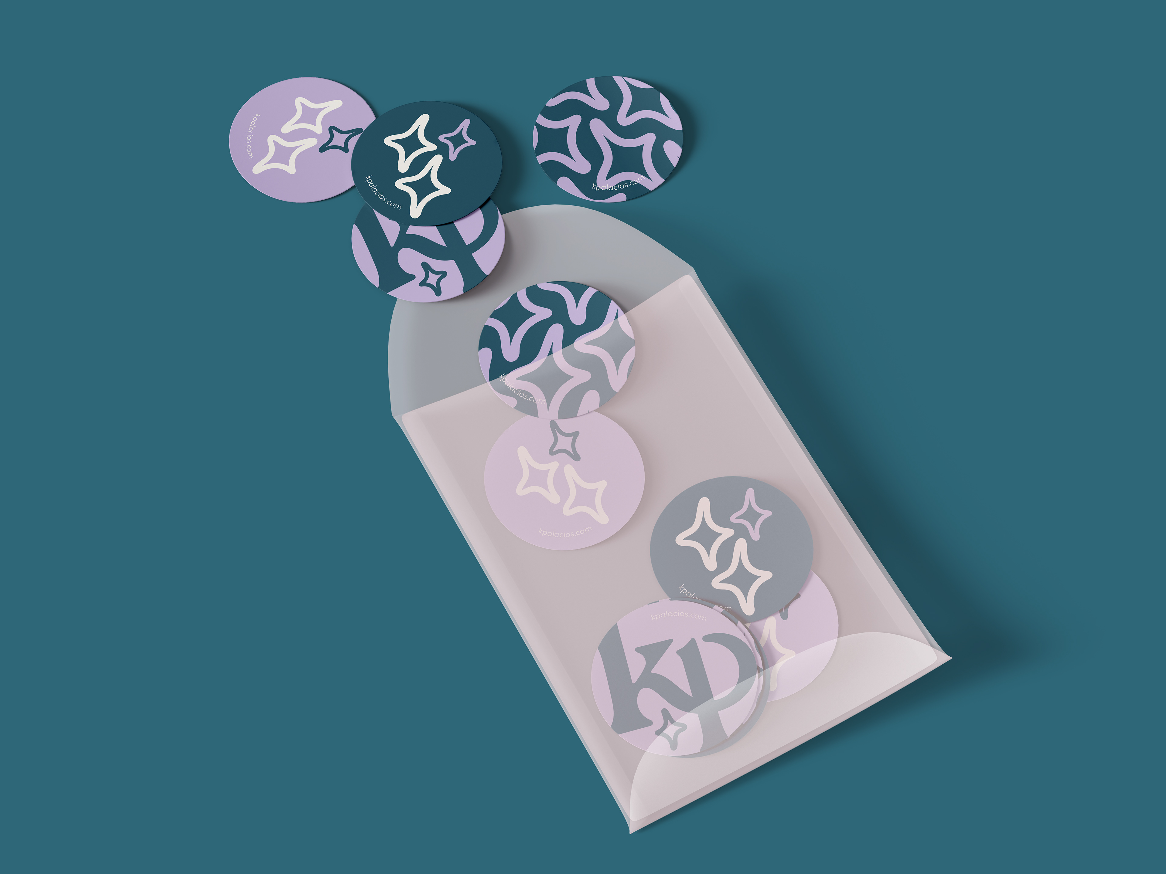
Personal Identity
With a lot of effort, I was able to present myself in a visual manner. I've always had a liking for this shade of light purple and I also enjoy vibrant, bold colors. The stars as a graphic element represent not only my passionate personality but also my witty side.